Case study: using Touch Stay for enhancing visuals
We spoke to Touch Stay user Dani Stein about how his guidebook has helped him to showcase his beautiful imagery and help him get longer bookings.

Designed to be beautiful as well as useful
We designed Touch Stay to be intuitive, easy to use and beautiful.
For users who have already invested in beautiful imagery, using Touch Stay as a way to showcase those images can have powerful results for their businesses – including longer bookings.
We spoke to Dani Stein about how using Touch Stay for his property in Bali has helped him power charge his collection of beautiful images and help grow his vacation rental business. As a photographer, Dani has combined his own collection of stunning imagery with the intuitive and elegant design of Touch Stay, resulting in a digital guidebook that helps him secure longer stays and happier guests.
Scroll through to read the case study. You can also watch our interview clips between Dani and Hannah (Touch Stay’s Content Manager).

About Dani & his vacation rental business
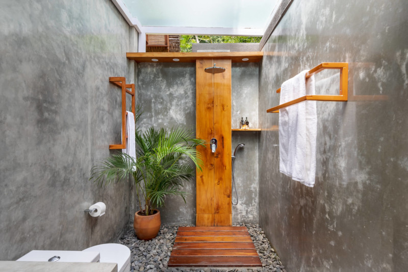
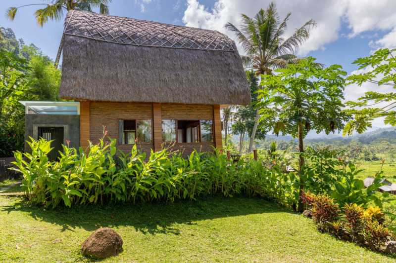
Having lived abroad for over 20 years, Dani had always wanted to invest in vacation rental property. Over the last couple of years, he made that dream come true when he and his wife became the proud owners of the beautiful Villa Uma Dewi Sri – a stunning vacation home in Sidemen, Bali.
Despite being new to the industry, Dani knew exactly how he was going to approach his vacation rental business. With a background in design and photography, he knew that high quality visuals were going to play a key part in driving his business. He was also tech savvy, and wanted to automate as much of his business as possible. These two priorities were exactly what led him to find to Touch Stay.
He explains how Touch Stay made such a positive and friendly impression:
"I’m a visual guy – I like taking photos and I do some web design and stuff. So for me the Touch Stay website, the layout of the guidebook and how easy it was to customise all attracted me.
And that’s how I came to choose Touch Stay. And I’m delighted! You know, it feels almost like a family. They have this Facebook group and everyone talks to each other and Andy (Touch Stay owner) jumps in there, too. So you feel like you’re a customer, but also part of the team. And that just makes it even more fun to use – even more fun to use than it is anyway!"

Great support as a user
Dani also talks about how much support there is for him as a Touch Stay user – new and ongoing.
“You don’t feel like you’re on your own, you know. Instead it’s like, now you bought the thing, look what you can do with it! They’re always answering your questions if you don’t know how to do something.
And you can read the help sections on the website or you can scroll through the Facebook group. Many people have already asked the same questions, so you don’t have to wait for someone to come back to you.”
Touch Stay helps visuals really stand out
Located in Bali, Dani’s rental property faces a lot of competition from other beautiful places to say. He realised his rental could become easily lost in an ocean of other generically “nice” images unless he made an effort to stand out. He explains:
“I think visuals are the single most important thing when you set up a listing on an OTA and even your own website.
You look for Bali on Airbnb and all these listings come up – and probably 90% of the pictures you see they show swimming pools. So how you stand out of that crowd? How you do make guests, who are already overwhelmed by all those pictures, stop and click on your listing and not keep scrolling? And the only way is through visual.”
He explains that by putting more effort into visuals and enhancing them by using things like Touch Stay guidebooks, he stands more of a chance of capturing overwhelmed tourists who are looking for something special.
“I think as well as visuals, things like Touch Stay guidebooks show your guests, or the people who are looking to book, the extra step you’ve taken, the extra effort you’ve put into your listing. And maybe it’s the guest’s subconscious that tells them, ah, that looks like family, that looks nice – there must be something nice about that place.”


Good visuals encourage guests to read your guidebook
Lastly, Danny recognises that there’s an ongoing conundrum for hosts when it comes to making sure guests read guidebooks. However, he actually thinks that good visuals and nicely organised content is the winning formula to secure guests who really engage with the guidebook
“You have to present everything in a nice package and I think Touch Stay in itself, the way the guidebook is built with the sections and icons and things is very interactive, so it’s already great. Not many people know that sort of layout, but you can actually click through like a website or a mobile app, and this already helps a lot.
And then when you’re able to loosen the content up with nice visuals, with images that relate to the content, it just makes it easy then – and I don’t know – instead of scrolling on Facebook for half an hour, you go and read your guidebook. At this moment, you’ve given your guests, even before they’ve come, already something, something of value.”
Want to learn more about Touch Stay?
We’d love to show you around!
Why not sign up for our 14-day free trial?
(No credit card needed!)