Summarize in
Creating an event brochure is a fundamental part of event marketing strategies. They serve as invaluable tools for promoting and communicating information about upcoming events.
Nowadays, everything from shopping to socialising happens online, so if you want to talk directly to your audience, you need to go where they are. The concept of creating a digital event brochure has become increasingly popular, in line with the increased reliance on digital platforms for communication and engagement.
In this guide, we’ll walk you through how to create an online brochure for an event, covering everything from understanding your audience and selecting the right online tools to crafting compelling content and incorporating multimedia elements. Whether you're a seasoned marketer or a newcomer to the world of event promotion, this guide will equip you with the knowledge and skills needed to craft an impactful online event brochure that captivates your audience and drives engagement.
- What is a brochure?
- Understanding your audience and event
- Choosing the right online tools and platforms
- Designing your event brochure
- Crafting compelling content
- Incorporating multimedia and interactive elements
- Reviewing and revising your event brochure
What is a brochure?
A brochure is like a pocket-sized tour guide for your event or business, offering a snapshot of what you have to offer. It's the ultimate icebreaker, designed to captivate your audience's attention and entice them to learn more. Anyone looking to promote an event, product, or service can benefit from creating a brochure.
Brochures should pack a punch of information without overwhelming the reader. They should answer the who, what, where, when, and why of your event or business, guiding potential attendees or customers through the essential details with clarity and style.
Brochures come in print and digital formats. While traditional print brochures have their charm, online brochures offer more possibilities.
An online brochure can be easily shared across digital platforms, reaching a wider audience with just a click. Plus, they're eco-friendly and cost-effective, saving you both paper and printing expenses. So why limit yourself to physical copies when you can go digital and make a bigger impact?
Understanding your audience and event
Understanding your audience and event is the secret to making the most out of marketing brochures. It's all about knowing who you're talking to and what they want to hear. When you understand their needs, preferences and pain points, you can tailor your messaging to speak directly to them.
And it doesn't stop there. The design of your brochure should be a mirror reflection of your event's vibe, purpose, and theme. Think of it like dressing for an occasion; you wouldn’t wear a tracksuit to a black tie event. Whether you're creating an online event brochure, the key is to put yourself in your audience's shoes and ensure every design choice emulates the style of your event.
Start by digging deep into demographics, psychographics, and behavioural patterns to uncover insights that can inform your content and design choices. In essence, demographics tell us ‘who’ people are, while psychographics tell us ‘why’ they do what they do. Demographics focus on objective, measurable characteristics of a population such as gender and age, while psychographics delve into subjective and psychological aspects of a population.
This includes factors like personality traits, values, interests, hobbies, lifestyle choices, attitudes, opinions, and behaviours. These are crucial for understanding target audiences and tailoring marketing strategies effectively.
Then, add in your unique creativity and flair to craft an online event brochure that not only grabs attention but also resonates with your audience on a deeper level. When your brochure feels like it was made just for them, your audience will engage with it more.
Choosing the right online tools and platforms
When you’re considering how to make a brochure, choosing the right online tools and platforms is essential for finding the perfect fit for your needs and style. Fortunately, there’s a plethora of user-friendly design platforms and specialised brochure-making tools out there, readily available to you.
Each comes with its own set of features, ease of use, and price tags, so it's important to do your homework before diving in. Want something sleek and intuitive? Look no further than platforms like Canva or Adobe Spark, which offer drag-and-drop simplicity and a treasure trove of brochure design ideas. Need more advanced customisation options? Consider tools like Marq (formerly LucidPress) or Visme, which cater to users with a knack for fine-tuning every pixel.
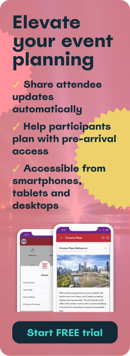
For something more all-encompassing, check out Touch Stay’s digital event app. This allows you to update content quickly, cater to multilingual audiences, and it’s accessible from smartphones, tablets and desktops. Not only do these event guidebooks look fantastic, but they also make event planning stress-free with their automatic update feature so your attendees can always view the latest information.
Don’t be afraid to check out event brochure examples for inspiration; Pinterest is a great place to look. If you collect a sample of brochure designs that you like, you can select your favourite design elements from each one and blend them together to create your dream event brochure. It’s usually a lot easier to spark your imagination when you’ve got a foundation to build off.
Ultimately, the key is to match the tool or platform to the specific needs of your event and your expertise level. Whether you're a design novice or a seasoned pro, there's a perfect fit waiting to help you bring your online event brochure to life.
Designing your event brochure
When we think of how to design a brochure, the key is to have a solid foundation with a well-thought-out layout that guides the reader's eye seamlessly from start to finish. Although the aesthetics of an online event brochure are key in grabbing a reader’s attention, the layout needs to be intuitive and easy to follow, or they will switch off.
Research shows that 78% of recipients quickly look at marketing brochures, while only 23% read them through properly. This highlights the importance of a navigable layout. You want to break down barriers, not create reasons for a reader to disengage from your event brochure.
Once you’ve nailed this, you can get onto the fun part. There are a couple of key things to consider:
- Colours
- Typography
- Imagery
All of these elements can significantly impact the outcome of your online event brochure. The colours, typography, and imagery are like an artist's palette, fonts, and brushes; choose them carefully to represent the right mood and personality for your event. Bold and vibrant for a music festival, perhaps, or sleek and sophisticated for a corporate conference. They can’t just look great, they need to convey the event’s message effectively.
Adobe created a super useful resource, explaining how to use colour psychology to complement and amplify your message. It covers what colours mean and how they make people feel. For example, red is a strong colour with both positive and negative connotations. It can symbolise strength, passion and confidence, but it can also suggest anger and danger depending on how you use it.
Where you put things matters just as much as what they are. Content placement is really effective in guiding your reader through the event brochure and strategically emphasising key points. You can use visuals to complement your message and bring it to life, whether through stunning photographs, playful illustrations, or eye-catching graphics.
The balance of text and imagery is also really important. You shouldn’t overwhelm readers with too much text, nor should you clutter your event brochure with too many pictures.
Crafting compelling content
Crafting compelling content for your online event brochure should be a high priority. It's your chance to grab your audience's attention and convince them why your event is worth attending over any other. And usually, less is more.
Aim for concise yet persuasive copy that gets straight to the point and leaves a lasting impression. Structure your content effectively with attention-grabbing headlines, informative subheadings, and bite-sized bullet points that make it easy for readers to scan and digest the information.
Also, don't underestimate the power of a compelling call to action. It’s the last thing your audience will read on your online event brochure, and it should prompt them to take the next step. Whether that’s registering for your event, visiting your website, or making a purchase, it needs to pack a punch.
When writing your copy, focus on highlighting the event's unique selling points and what sets it apart from the competition. Showcase the benefits and value proposition in a way that resonates with your target audience and sparks their curiosity.
Incorporating multimedia and interactive elements
The beauty of creating an online event brochure is that you’re not limited to traditional text and images. You can flex your creative muscles, think outside the box and embrace the power of multimedia and interactive elements.
Imagine adding a captivating video that gives viewers a sneak peek of what to expect at your event, or incorporating dynamic animations that bring your content to life. Audio clips can also be a game-changer, allowing you to speak directly to your target audience, set the mood, and build excitement.
But why stop there? Make your online event brochure truly interactive by including clickable links that direct readers to relevant websites or resources, QR codes for easy access to additional information, and social media integrations that encourage sharing and community engagement.
By incorporating these multimedia and interactive elements, you're not just creating an event brochure; you're crafting an immersive experience that captivates your audience and leaves a lasting impression.
Our digital guidebooks at Touch Stay are a great way to incorporate these elements. Take a look at some of our example guides to see how they could influence your brochure design ideas.
Reviewing and revising your event brochure
When you get to the reviewing and revising stage, you’re in the final stretch of creating your online event brochure. Thorough proofreading and editing are non-negotiables when it comes to ensuring your event brochure is as accurate and professional as possible.
As a minimum, you need to check for any spelling and grammatical errors. Grammarly is a great tool to streamline this process. Of course, you need to make sure all the information you’re providing is correct. And you should also make sure that everything is consistent, from font size to branding.
Don't be afraid to enlist a fresh pair of eyes. Ask for feedback from colleagues or friends and embrace constructive criticism with open arms. Remember, two heads are better than one when spotting potential pitfalls and fine-tuning your event brochure.
Summary
To wrap up, we've explored the ins and outs of creating an online event brochure. From understanding your audience to utilising online tools, designing your event brochure and writing effective content, we’ve covered all you need to know. By harnessing the power of an online event brochure, you can reach a wider audience, drive engagement, and leave a lasting impression.
Remember, thoughtful layouts and designs, compelling content, and interactive elements are the keys to success in this digital age of marketing brochures. So, armed with the tips and strategies provided, it's time to dive in and create impactful brochures for your own events.
At Touch Stay, our digital guidebooks can be used to create comprehensive and interactive online event brochures. Easily customisable and well-structured, you can rest assured that our platform is a great foundation to build a user-friendly and engaging online brochure for readers.
Start your free trial now to see how you can create an online event brochure that will revolutionise the way you market your events.

Ned
Ned has clocked up over 11 years in digital marketing and comms, with a strong focus on creating engaging content for a range of brands and agencies. When he’s not writing, he can be found digging for records, peering through his telescope at the night sky, or onboard his local lifeboat where he volunteers as a crewmember.
Be the first to know!
Join our newsletter for early access to:
- ✅ Free guides
- ✅ Pro tips & tricks
- ✅ Time saving tutorials
- ✅ Latest blog posts
- ✅ Checklists & templates




.png?width=50)